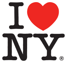
Before 9/11, before the 80s, about the time that everyone owned a TV, the lights of The Great White Way, Broadway, they were fading. Live entertainment became the business of taping a variety show. New York City was no longer a destination.
It was more than a campaign.
It became a slogan!
It was a pro bono gig.
The genius of Milton Glaser along with Bobby Zarem volunteered their graphic design talents because they expected the campaign to last only a couple of months, waving the rights to royalties, and in hindsight the simple design is worth millions and more. The innovative pop-style icon became a major success.
1977 Deputy Commissioner Doyle, aware of the increase in crime and the welfare burden all of which reached a nadir in the city's fiscal crisis of the 1970s. New York City needed the revenue and ‘I (heart) NY,’ the logo, a rebus, became the icon, the pulse, the positive affirmation, the ID.
The simplicity is its beauty.
Everybody sing!
“If I can make it there, I’ll make it anywhere. Come on come through, New York, New York.”

Interesting....I didn't know much about the origin of the logo, only that it's iconic!
ReplyDeleteI agree with Peter Fox Shoes---thanks for sharing that interesting background info!
ReplyDeleteEverything about that logo is simple but says so much. Thanks for sharing.
ReplyDelete